
Nothing Phone 2: Two-minute review

The Nothing Phone 2 is such a rarity in today’s phone world, it’s hard to believe it even exists. It’s an affordable phone made by an independent company with some simple, effective, and unique ideas. It’s also a good phone. If you’re bored with the same old flat slabs and colorful icons, the Nothing Phone 2 may be exactly what you want.
That doesn’t mean the phone isn’t a bit overhyped. The glyph interface looks cool, but in my weeks reviewing the phone before launch, I hardly used it. I wanted to use it more, but it just doesn’t do much and it doesn’t work with every aspect of the phone, not even close. When a feature looks cool and adds bulk but doesn’t actually make the phone better, we have a word for that: gimmick.
There are great ideas hidden inside the Nothing Phone (2). Samsung and Apple would be wise to pay attention, though it wouldn’t be hard to copy things like larger app icons and a monochrome interface option to remove distractions. In other ways, though, the software felt buggy and a bit half-baked. Some app icons looked great when I got my review unit, but a later update broke things and made them incomprehensible.

Nothing has been working hard on software since the first Nothing Phone launched, but it still has a ways to go, and the Phone 2 leaves me questioning if Nothing, or any small phone company, can really compete against monstrously large development houses like Google and Samsung and Apple.
The biggest weakness is the camera. Nothing claims the camera has been greatly improved, but compared to other smartphones in this price range the cameras are way behind. If you want a phone that looks good, get the Nothing. If you want a phone that makes you look good, get something else.
I think potential Nothing Phone 2 fans will see the device and something will click. If you find the glyph lights hypnotic, and you like where CEO Carl Pei is coming from with his minimalist and thoughtful interface, the Nothing Phone 2 won’t disappoint. It delivers much better performance all around than the first model while remaining affordable compared to big, boring flagships from Samsung and Apple.
Nothing Phone 2 review: price & availability

- Starts at $599 / £579 / AU$1,049
- Available directly from Nothing and in pop-up stores
- Not sold in carrier stores, no trade in offers
Nothing didn’t sell its first Nothing Phone 1 in the US, not officially at least, and the first phone was much less expensive at £399 / AU$749 in the UK and AUS. This time around, Nothing opted for more powerful components inside, a more premium design, and higher specs all around. The phone is more expensive, starting at $599 / £579 / AU$1,049, but it feels much more premium.
To compare, the Nothing Phone 2 costs about the same as a fully loaded Google Pixel 7 (with 256GB of storage) or a OnePlus 11. There is no Samsung Galaxy S phone offered this cheap, not even the Galaxy S22 from 2022 that Samsung still sells. If you want an iPhone at this price you can buy a new iPhone 12 from Apple.
This is an unusual price point, and the divide is because those more expensive phones are all available in carrier stores, which means you can get a discount if you trade in your old phone for a new one, and you can get a deal if you sign up for a payment plan or a carrier contract. The Nothing Phone 2 offers none of that. No trade, no deals. You give them the cash, they give you the phone.
Is the Nothing Phone 2 worth the price? It comes with a premium Qualcomm Snapdragon 8 Plus Gen 1 mobile platform, but the OnePlus 11 is already on Gen 2. The Nothing Phone 2 isn’t beating any competitors on specs, so you’re really paying for the design.
There’s nothing wrong with that. The design is truly unique and stands apart from the rest of the phone world. You can’t put a price on design, and if you’re happier every time you use the Nothing Phone 2 than you would be every time you use a boring, featureless black slab, then it’s worth the premium.
The big question is service and support, for which Nothing has an unproven track record. When a phone is sold in a US carrier store, it has been thoroughly tested and vetted by the wireless carrier to make sure it works exactly as well as customers expect. When no carrier will offer a new phone, it makes us question the phone’s reliability and support.
Nothing Phone 2 review: specs

| Dimensions: | 161.2 x 76.4 x 8.6 mm |
| Weight: | 201.2 g |
| Screen: | 6.7-inch LTPO OLED display, 1600 nit brightness |
| Resolution: | 2412 x 1080 pixels |
| Refresh rate: | 1-120Hz |
| CPU: | Qualcomm Snapdragon 8 Plus Gen 1 |
| RAM: | 8GB / 12GB |
| Storage: | 128GB / 256GB / 512GB |
| OS: | Nothing OS 2 with Android 13 |
| Rear Camera: | 50 MP, f/1.9, 1/1.56″, 1.0µm, PDAF, OIS |
| Ultrawide camera: | 50 MP, f/2.2, 114˚, 1/2.76″, 0.64µm |
| Front Camera: | 32 MP, f/2.5, 1/2.74″, 0.8µm |
| Battery: | 4700 mAh |
| Charging: | 45W wired; 15W wireless; 5W reverse wireless |
| Colors: | white, gray |
The Nothing Phone 2 uses the Snapdragon 8 Plus Gen 1 mobile platform from Qualcomm. That was the best chipset Qualcomm offered in late 2022, but at the beginning of 2023 the Snapdragon 8 Plus Gen 2 chipset showed up in phones like the OnePlus 11 and the Samsung Galaxy S23.
The Nothing Phone 2 display is top-notch with LTPO technology that lets the phone adjust the refresh rate to save power. It’s also plenty bright; brighter than competitor phones at this price.
Some Android phones are available with more than 12GB of RAM, but this phone should perform well with either memory configuration. For storage, 128GB will be enough for most people, but if you plan on recording a lot of movies or downloading seasons of shows from your favorite streamers, you’ll want more space.
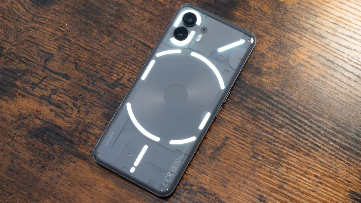
Nothing Phone 2 review: design

- More rounded and textured than Phone 1
- Very unique look and feel
- Glyphs are cool, wish they were used more
There is no mistaking the Nothing Phone 2, whether you’re inspecting it up close or caught off guard by its flashing glyph lights from far away. The phone feels bigger and heftier than competitors, even though it’s the same thickness as the Pixel 7 and the OnePlus 11. The dramatically rounded glass back makes it feel more substantial somehow. Perhaps it’s the depth of seeing through the glass and into the phone. It’s not uncomfortably large, just bigger than expected.
The rounded back has a bit of a death wish, unfortunately. The curved glass seemed to slip from every surface on which I placed it. It became a running joke during my review. I’d hear something clatter to the floor from the side table or desk. My kid or girlfriend would ask “What was that?” Then we’d both remember and nod and say “Oh right, Nothing” at the same time.
If there were four phones on my desk, the Nothing Phone 2 would be the one to fall. Its smooth and shiny surface, married to a gently curved back, makes it more susceptible to falls, especially if there is any incline for gravity to do its work. Be careful with this phone, it isn’t grippy and inertia won’t help you.
This wasn’t as much of a problem when I left the phone with its flat face down and used it the way I was supposed to: flashing glyph lights face up. The entire design of the Nothing phone, inside and out, is aimed towards not using it. Or making the phone harder to use so you use it less. Okay, I still don’t quite understand the ethos behind Nothing design, except that it promotes familiar tropes of mindfulness and reducing distraction that are in vogue right now.

To get there, the LED light pattern on the back, the so-called glyph, can also act as a timer. Right now it only works with Uber, but eventually, it could work with any app that has a countdown or a wait. As your Uber ride gets closer, one of the glyph bars lights up and then gets smaller and smaller. There is also a glyph timer that works the same way, shrinking as your time elapses.
The idea is that you’ll use your phone less if you can use the glyph on the back instead of lighting up the screen to check on your Uber. You’ll be less distracted by your games and social network feeds and messages if you can glance at your pizza timer on the back of your phone, instead of swiping through your home screen.
Does it work? Not really. Don’t get me wrong, the glyph looks very cool and seems capable of some neat tricks. It’s just that the phone doesn’t seem capable of taking full advantage of the glyph.
There are supposedly hundreds of LED lights divided into multiple strips on the back of the phone, yet the best it can manage is some syncopated flashes and a single shrinking countdown strip? Where’s the rest? So much complexity is hardly being put to use, and it feels like a missed opportunity. Tragic, considering this is the key selling point for Nothing Phone 2.

Durability is going to be an issue with the Nothing Phone 2. This sequel is more water resistant than the original Nothing Phone, but not by much. It can take a splash, but you can’t dunk it. Heavy rain could probably destroy this phone.
What concerns me more is that big, curved glass back. My phone fell frequently during testing and I developed a hairline crack in the screen. It’s not noticeable unless I tilt the phone just so. The back is so far unblemished, but I’m worried. While Nothing did spring for one of the best mobile processors it could put inside a smartphone, it did not opt for the strongest Gorilla Glass on the outside.
Once your phone breaks, what do you do? You need to work with Nothing directly. There is no third-party repair service for Nothing Phones. Unlike Samsung and Apple, which license third-party shops to repair the best iPhones and best Galaxy phones, with a Nothing phone you’ll need to rely on the company’s responsiveness, and such a new company has no track record to recommend them.
Nothing Phone 2 review: display

- Very nice display for the interface
- LTPO technology for power savings
- Brighter than competitors at this price
The Nothing Phone 2 uses a very nice display, just like the first device, but this time it gets a boost from newer technology to help with battery savings. Nothing relies on a monochromatic interface, so unless you are running an app, you’ll probably see mostly black and white. The OLED screen on the Nothing Phone 2 looks great with this design – dark and contrasty where needed – and it makes the skin feel very dramatic.
With LTPO technology, the screen can slow down to one refresh per second or ramp up to 120Hz, as needed. That makes for an always-on display that won’t drain your battery significantly, and Nothing does a nice job designing the always-on screen and making it very useful.
While the Nothing Phone 2 isn’t technically as sharp as its rivals, like the Pixel 7, it can get much brighter than other phones in this price range, and that’s a perfect trade-off. I had no trouble shooting photos on the Nothing Phone 2 display in bright sunlight or reading directions on a hiking map.
Durability is a concern, as I’ve mentioned in the Design section. During my testing, my Nothing Phone 2 developed a small hairline crack in the display. It’s unnoticeable even if I rub my fingernail across it, but I don’t usually crack phone screens. This phone just has a very slippery, curved back that makes it easy to fall off a surface with any incline or slipperiness.
Nothing Phone 2 review: cameras

- Cameras are not very good overall
- Dynamic range and HDR are a serious problem
- In this price range the competition is fierce
Let’s be frank, if you really want a great camera on your smartphone and you only have $599 / £579 / AU$1,049 to spend, there are some surprisingly good options to choose from, and the Nothing Phone 2 isn’t one of them. The photos are improved over the last generation, but the last generation was a seriously inexpensive bargain phone. This is a premium model, albeit an affordable premium phone. The photos just aren’t very good.
Image 1 of 5

The Nothing Phone (2) especially struggles with dynamic range and producing shots with a good HDR effect. That means that the dark spots in your photos are going to be very dark and you’ll lose detail to shadows. Most smartphones these days focus on improving dynamic range, so this is the most noticeable difference between Nothing and the competition, like the Pixel 7 and the OnePlus 11.
In fact, the Nothing Phone (2) was simply terrible at HDR shots. When I tried a selfie with the Chrysler building behind me, I could choose to properly expose the building or my face, but not both. Either the building was washed out, or my face was hidden in darkness.
Image 1 of 2
I found the camera app to be a bit unresponsive and hard to use. When I tried to tap on an area to focus, the camera would often ignore my taps, especially if I was tapping just a bit off-center. Sometimes I would press the shutter button and it would not snap a photo. The volume key as the shutter button always worked fine, at least.

There are only two lenses on the Nothing Phone 2, unlike the Pixel 7, which gives you an ultrawide as well as a zoom lens. On the Phone 2, you only get wide and ultrawide. Don’t bother with the digital zoom, it leaves photos looking blocky and unusable.
Even under the best conditions, I lost too much detail to blown-out highlights, which is just a further effect of bad HDR processing on this phone. Some photos looked nice, and the extra warmth that the Nothing Phone 2 adds to most shots actually makes food look more appealing. Still, I’d like to see serious improvements if Nothing is going to compete in this premium space.
Image 1 of 9
I’m not going to beat up on Nothing more than this. There are distinct advantages to the Nothing Phone (2) and the camera isn’t among them, but there are other great camera phones at this price range. If the camera matters a lot, look elsewhere.
Nothing Phone 2 review: software

- Unique and simple interface design
- Key improvements, like larger icons, have an impact
- Not enough integration of the glyph lights
When Nothing handed off this review unit, it talked about how many more software engineers it added to the team, and I can’t help comparing Nothing’s hundred or so developers to the thousands of software engineers working at Google and Samsung. The difference shows. With the Nothing Phone 2 you get a few good ideas implemented nicely, but the Nothing Phone 2 hardware is not well-integrated with the software. I wonder if the task is too great.
First of all, my glyph lights kept turning off. There is a setting that lets you completely deactivate the glyph lights. I never touched that setting, but once a day I had to dive into the menu and reactivate the glyph. This was because I had a bedtime focus mode enabled, which turned off the lights. The system should be smart enough to turn them on again.

I expected the glyph lights to be available and useful throughout the phone. Nothing offers a glyph timer, for instance, but it isn’t part of the normal Android Clock app. In other words, when I say “Google set a 6-minute timer,” I don’t get glyph lights. I just get the normal Google app.
If I want the glyph timer, I need to find it, and it’s very hard to find because it’s buried in the Settings menu. You can’t even change the countdown time, not easily. You can set a six-minute timer and then have the same six minutes every time, but if you want five or ten, or a hundred minutes, it’s back to the Settings menu.
If the basic glyph timer is so hard to use, you can imagine that the glyph lights are not easily integrated into the system. When you set an alarm, you don’t get glyph lights. If you play music, there is no dancing glyph music visualizer. I was continually searching for ways to use the glyph lights, ways to experience the phone through the lights and not the screen. I had a hard time finding anything.

You can customize ringtones with the glyph lights, and you can set different lights for different people, or different types of notifications. That’s kind of useful, but I could have a simple sound effect do the same thing. You can use the lights as a fill lamp for the camera, but it isn’t powerful enough to light up your subject unless you’re fairly close.
If the lights are a disappointment, the interface was a pleasant surprise. The NothingOS 2 is a fairly basic Android implementation. Nothing isn’t adding a ton of features like you’ll find on Samsung Galaxy phones. Instead, Nothing tries to eliminate distractions by eliminating color and text.
Your apps will be black and white. They won’t be labeled. That means they’ll be harder to find, at least at first. Once you figure out what icons look like, it’s actually a very clean and pleasing look for a home screen. I had no trouble getting used to the Nothing interface, and I liked some of the simple tweaks.

My favorite is the ability to blow up an app icon to four times its normal size. Instead of taking up one square on the home screen grid, it takes up four. For my favorite, most-used apps like Waze maps and my TV’s Roku remote control app, that was an invaluable shortcut. Much nicer, even, than finding a widget to act as a remote or start a mapping session. It turns out I didn’t need a widget, I just needed a bigger button.
Nothing even does a nice job with the always-on display, and I found Nothing’s off-screen to be more useful than on my Samsung or iPhone. Of course, those phones have many times the features and customization options that Nothing offers, but simplicity is the point here, and I think Nothing creates an effectively simple home screen that makes the phone a pleasure to use.
Nothing Phone 2 review: performance

- Probably faster than it needs to be
- Camera app could be unresponsive
- Faster than a Pixel, slower than OnePlus
With the second generation Nothing Phone 2, Nothing gave the phone a big upgrade in processing power, jumping from a bargain, mid-range chipset to a flagship-level Snapdragon 8 Plus Gen 1 platform. That’s the same chipset used on the Samsung Galaxy Z Fold 4 and the Motorola Razr Plus (Razr 40 Ultra). There is a newer Snapdragon, the Gen 2 chipset found in the OnePlus 11, but the differences are marginal.
The Nothing Phone 2 performed very well and had no trouble throughout my tests, at least when it came to running the fastest apps and newest games. Everything ran smoothly and looked sweet on the Nothing Phone’s fast display.

I had some response issues with the camera, and I’m not sure if that’s a performance problem or a software problem, since Nothing writes its own camera app instead of using the stock Google Android Camera. Sometimes I’d press the button or navigate between modes and the camera would freeze and stall for a second or two.
If you want a faster phone than this for the same price, the OnePlus is a bit faster, but you’ll only be able to tell in benchmark tests. The Nothing Phone 2 has plenty of power to run games at high graphics levels, and the visual flourishes Nothing adds to the interface look very smooth running on this phone.
It may help that I am using the highest-tier model of the Nothing Phone 2 for my review. There are 8GB and 12GB models available, and that much RAM can make a difference in an Android phone. I’m sure apps will still run smoothly on both models, but if you switch between apps often or work with large games, you might want to spring for the extra memory.
Nothing Phone 2 review: battery

- More than a day of battery life
- Great improvement over the original Nothing Phone
- Charging glyph is nice … where’d it go?
The Nothing Phone 2 gets a slightly bigger battery than the original phone, perhaps owing to being a slightly larger phone all around. I had no trouble making it through a full day on a single charge with the Nothing Phone 2, and there are probably many aspects of the phone that help.
First, having a black and white interface may save some power, but probably not much. Nothing’s concept of having you rely on the glyph system rather than using the phone display would also save power, except that it isn’t very effective. Perhaps when more app makers start using the glyph system, I would turn on the phone less, but right now it is hardly useful, so I can’t give it credit for saving power.
Not using the camera helps a lot, as the camera drains more power than most other features. I don’t mean to snark, but when I have a phone with an amazing camera, I drain the battery faster.

For charging, I used an Anker charger capable of up to 65W, much more than the 45W charging that Nothing Phone 2 offers. Nothing says this phone can charge to 100% in 55 minutes and I can verify that claim. I got to a full battery in under an hour.
There is a charging glyph when the phone is plugged in, and it’s sort of emblematic of the whole problem with the glyph system. There are myriad ways Nothing could use the glyphs to show me that my phone is charging, and how much longer it will take. It could light the glyphs slowly, or fill them all individually. I’m not a designer, but anyone could come up with something better than what Nothing offers.
When you charge the phone, you get a little bar of light at the bottom of the phone near the charger, but only for a moment. You can’t opt to keep that light lit, even though it’s a low-power LED and the phone is plugged in. If you want to see the light again, you need to wiggle the phone. Wiggle it, just a little bit.
I’d like a persistent light, and something larger than just the smallest bar at the bottom of the glyph. Why not embrace the glyph with everything we’ve got? Like other aspects of the phone, the battery and charging treat the glyph as less than a feature, and more like an annoyance.
Should you buy the Nothing Phone 2?
| Attributes | Notes | Rating |
|---|---|---|
| Value | A good price for such a unique design concept, with performance that holds up. | 3 / 5 |
| Design | Very unique design with a cool glyph light interface that is sadly underutilized. | 3 / 5 |
| Display | Great display that is brighter than most competitor phones in this price range. | 4 / 5 |
| Cameras | Cameras can’t handle dynamic lighting and lack the detail and quality of rival phones. | 2 / 5 |
| Software | Unique interface concept are simple, yet effective. Too bad the glyph is an afterthought. | 3 / 5 |
| Performance | Excellent performance from the Snapdragon 8 Plus Gen 1 processor, a huge improvement over the last model. | 5 / 5 |
| Battery | Great battery life that had no trouble lasting all day and even charged fast enough. | 4 / 5 |
Buy it if…
Don’t buy it if…
Nothing Phone 2 review: also consider
If the Nothing Phone (2) isn’t checking all the right boxes for your smartphone needs, there are plenty of great options for the same price, or even a bit less.
| Nothing Phone 2 | Google Pixel 7 | OnePlus 11 | |
|---|---|---|---|
| Price: | $599 / £579 / AU$1,049 | $499 / £499 / AU$999 | $599.99 / £729 |
| Display | 6.7-inch LTPO OLED, 1,600 nits peak | 6.3-inch OLED, 1,400 nits peak | 6.7-inch OLED, 1,300 nits peak |
| Platform | Qualcomm Snapdragon 8 Plus Gen 1 | Google Tensor G2 | Snapdragon 8 Gen 2 |
| Battery | 4,700 mAh; 45W charging | 4,355 mAh; 20W charging | 5,000 mAh; 100W charging |
How I tested the Nothing Phone 2
I have been using the Nothing Phone 2 as my exclusive smartphone for both personal and work purposes for the last couple of weeks before this review was published. I use it for everything I do with my smartphone, from messaging to gaming to photography to getting work done.
The Nothing Phone 2 is used in my car as my Android Auto device, and I use it with a variety of accessories, including smartwatches, bluetooth headsets, and an Xbox gaming controller for games. I charge the Nothing Phone 2 with my Anker 733 charger, since Nothing does not include a charger in the box.
I used a variety of apps with the Nothing Phone 2, including the latest games and all of the latest benchmarking software. While we benchmark every phone we test extensively, we do not rely on benchmarks to form our opinions, only for reference. Benchmarks do not always reflect real world performance.
I will continue to test the Nothing Phone 2 and update this review as it receives software updates. After the phone went on sale, Nothing offered a major software update, and every feature, especially the camera, was retested to account for any changes and improvements.
Read more about how we test
First reviewed July 2023